Data Through Design 2019
DxD 2019 showcased nine works at New Lab in the Brooklyn Navy Yard under the theme Not a Number. The works explored topics such as guessing values in between data points, surfacing unexplorable underground spaces, and exposing stories buried in datasets of births, food stamps, and evictions.
The ten day exhibition included a closing event with an artist Q&A followed by a panel entitled Everything is a Proxy. Participants discussed the risks of trying to model subjective concepts and how to utilize proxies when they’re the only option to make connections.

NaN - Not a Number
In computing, NaN (not a number) is a numeric data type representing an undefined or unrepresentable value. Sometimes, data is meant to represent unrepresentable features of the spaces, places, and people around us. This begs the question, how are the fundamentally unquantifiable things—the things that should otherwise return the computational error statement NaN—being assigned numerical values? We asked our artists to reflect on the stories within our city’s open data that speak to the undefined or unrepresentable value of the things that the data may be hiding.
Projects and Artists
NYC Trees Soundscape
Itay Niv & Aidan Nelson
Datasets: 2015 Street Tree Census, Wi-Fi Hotspot Locations, Subway Stops, Public Recycling Bins, DSNY Litter Basket Inventory
NYC Trees Soundscapes is a data sonification project based on NYC’s urban forest and architecture. The project reimagines routes through the city as tracks on a musical sequencer, with the city’s trees and urban elements (e.g. subway stops, wifi access points) as the notation instruments on these tracks. Using an interactive map displayed on a supersized touch screen, audience members are immersed in a synesthetic experience of the once-familiar landscape.


Collision Course
Karl Munstedt
Datasets: NYPD Motor Vehicle Collisions, Traffic Volume Counts, Air Quality
Collision Course is a series of real-time 3D virtual environments, which speculate upon the automation bias that is likely to drive our car-enabling transportation policies in coming years. Built using a game engine and inspired by my experiences as a New York City cyclist, these environments depict motor vehicle nightmare scapes. These environments examine the emotional consequence of machines continuing to take ownership of public space and bring into focus the absurdity of the silicon valley promise that autonomy will foster an age of efficiency and climate neutrality.
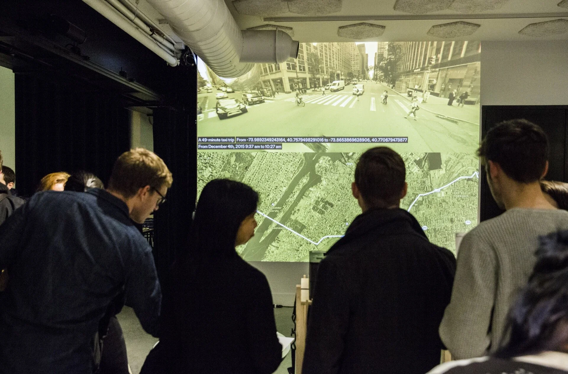
From Point A to Point B
Achim Koh & Wonyoung So
Datasets: NYC TLC Trip Record Data: Yellow Taxi, Citi Bike System Data
What happens in the empty space between data points? Data-based models are hungry for more data and granularity; when these latter are unavailable, data methodologies tend to fill in the blanks and estimate what is not measured by employing assumptions and proxies. While data are often associated with objectivity, in practice they involve imagination and interpretation as much as any field, creating fictitious versions fo the unrepresented, in the hope that these work well enough for practical purposes.
From Point A to Point B nodes to this data-based attempt to guess the in-between spaces, the fissures of data. However, it also acknowledges the fundamental irreconcilability of data and the world it represents. Instead of trying to render the world into an ‘accurate’ fixed state, it explores the potential states opened up by the sparsity of data. It takes the idea of inventing realities quite literally, creating speculative accounts based on people’s journeys documented in open data sets.
This work is an illustration of data methodologies’ reliance on guesswork and assumptions, which invent values where measurements do not exist. At the same time, it is a poetic exploration of people’s experience rendered invisible through its abstraction into numbers.
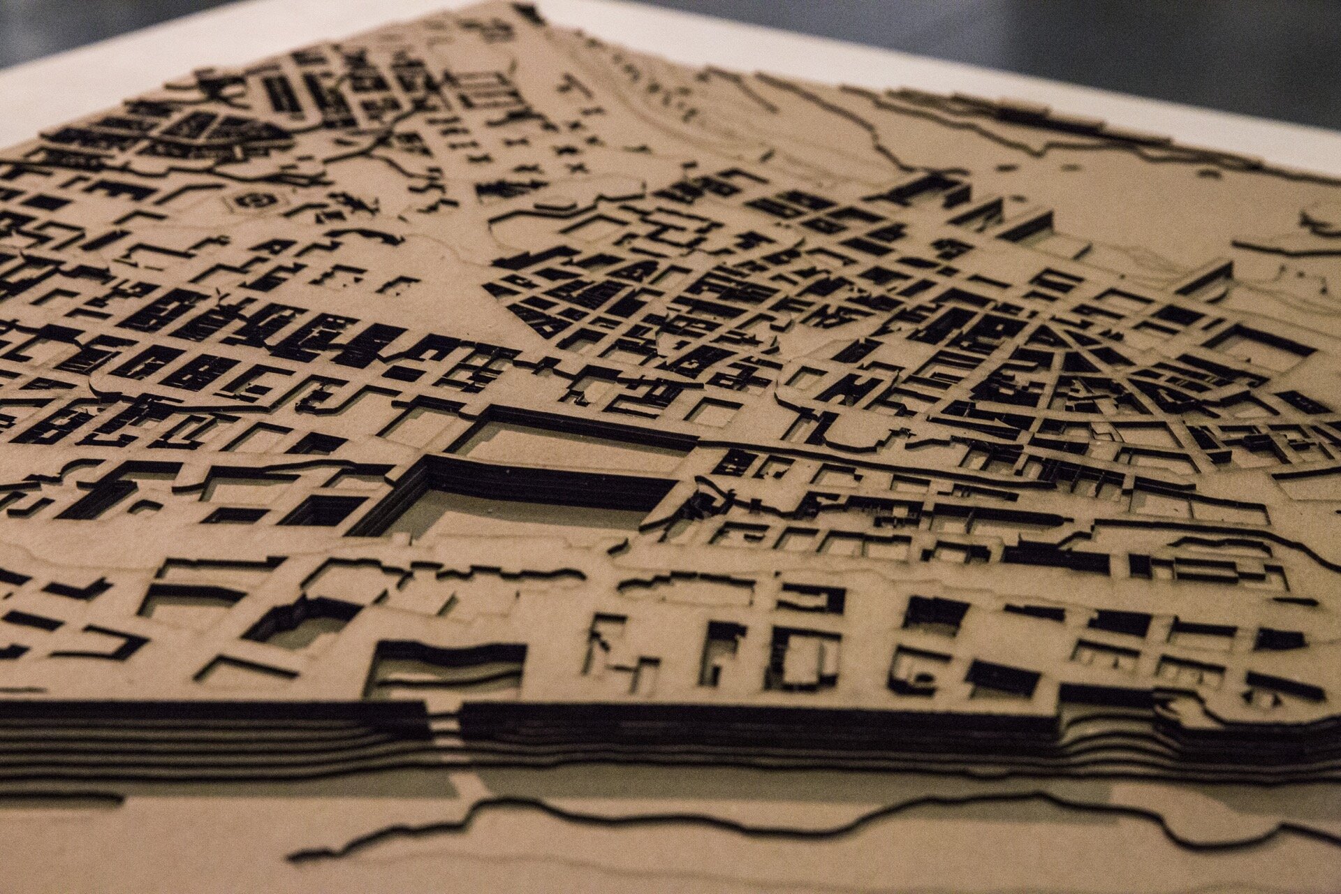
UnBuilding
Eric Forman
Datasets: MapPLUTO, NYC Building Footprints, US Geological Survey Bedrock Map, NOAA Bathymetric DEM
Hidden below every building in New York is a subterranean cavity dug into the earth. These negative spaces contain basements and foundations that make the structures above them possible. Yet these spaces are mostly invisible to us, and many are inaccessible even to a building’s inhabitants. UnBuilding shows an alternate reality where all of the man made structures have vanished, as if yanked out like teeth. Left behind are the ghost traces of the missing buildings: some are only one story deep, some reach surprisingly low belying the height of the structure above, some go all the way down to bedrock. These holes were dug over thousands of years, by thousands of workers, and form a negative inverse city as impressive as the above-ground version we see every day. It is these negative numbers, the space beneath, that make the entire city possible.
Special thanks to Sofie Iommi (Research Assistant), Pratt SAVI and Can Sucuoglu (Data Assistance).
Cards Against Hate
Stephanie Luu & Andrew Lin
Datasets: NYC Reported Hate Crimes
Cards Against Hate presents the annual “NYC Reported Hate Crimes” dataset in a physical, interactive medium and adding a layer of real stories sourced from the news. The 52 weeks represented in each deck correspond with the 52 cards found in a typical deck of playing cards. Each red card reveals the number of hate crimes reported for that group in a random week and includes an actual hate crime incident. By supplementing the data with real stories, we hope to provide a deeper insight on the prevalence, nature, and magnitude of hate crimes across social groups. The ultimate goal is to increase awareness of these experiences and empathy for the victims, our neighbors, and to increase the reporting of hate crime incidents to law enforcement.
Many hate crime stories were collected from Pro Publica, a nonprofit leading “Documenting Hate”, a collaborative effort dedicated to investigating hate crimes and bias incidents in the Untied States.


Tempo: Human Rhythm of a New York Day
Mollie Ruskin, Xena Ni, & Eric Chiu
Datasets: NYC Births (Infant Mortality), NYC Supplemental Nutrition Assistance Program, NYC Evictions
Hidden in city records are our emotional valences: hundreds of millions of dreams pursued, dreams deferred, hearts broken, sighs of relief. Very first breaths and very last. It’s hard to see and feel these experiences through numbers alone.
Tempo shows the scale, emotions, and rhythm of one day of New Yorkers’ interactions with city government. You’ll hear a slice of the thousands of stories embedded in datasets recording births, SNAP (also known as food stamps) cases, and scheduled evictions. You’ll see the frequency of each of these transactions and their total numbers, through masses of everyday objects and use of light. We invite you in to engage with the mess of simultaneous emotional moments pulsing through city data at any moment. And closer-in still, to meet the lives and the stories and the nuance beyond what any number is able to tell us.
Temporal Views of the Bike Lane
Crystal Penalosa & Melissa De La Cruz
Datasets: Bike Lane Coverage Map, Parking Violations, 311 Service Requests
There are more people than ever in New York City’s bike lanes and the city is quick to claim the crown, citing some 300 miles of lanes laid in the last five years alone. But the stats also tell us this: nearly 10,000 complaints oof a blocked bike lane, but only 57 have been resolved in a summons, a clear indication that 311 complaints are rarely enforced.
These numbers have failed to characterize the experience of sharing those lanes with everyone else. Think about all those near-misses as you swerve out to avoid a delivery truck or a ride-share, or maybe it’s a re-route into traffic thanks to a construction project. In a city where at least 45,000 residents cycle to work, a figure that’s two times more than any other city in the US, this is a problem.


Exhausted New York
Ana Mengote
Datasets: Air Quality, NYC Truck Routes, Community Survey, Current Zoning Maps and Census Data
Exhausted New York is a visualization of the state of Air Quality in neighborhoods of New York City. Some of the biggest problems of cities are invisible and intangible - such as air pollution. For example, datasets such as the Air Quality Index is meaningless until we put them in context and compare them to asthma rates. Exhausted New York aims to push this visualization further by creating an experience that mimics the essence of breathing polluted air.
Below, just a point
Pierre Depaz & Nicolas Grefenstette
Datasets: ACRIS, PLUTO + MapPLUTO, NYC DOB Building Information System, NYC DCP Environmental Impact Statements
Below, just a point is a light installation which highlights the cause and effect relationship between property transaction – often happening unbeknownst to and to the detriment of inhabitants – and the amount of sunlight that these inhabitants are exposed to. On a very physical level, property transfer results directly in the construction of ever-higher rises, following a logic of most value extraction from the land, which in turn manifests itself through a net disappearance of sunlight for current tenants and neighbors upon completion fo the construction work. It is the very experience of seeing the light disappear that prevents readers and audience members to truly experience what it meant, not to live in shadows, but to see the light disappear.
And yet, as the buildings rise, they obfuscate the original act of their creation – the financial exchange of mortgages – as they get buried deeper and deeper into the ACRIS database, supposedly upon, yet hardly searchable, hardly findable, only remnants of deeds.

Closing event: Artist Q&A and Panel
2019 Artist Roundtable Discussion and Q&A
The artist roundtable discussion provided a platform for our audience and community to hear directly from our 2019 artists about their experience working with civic data as a medium and/or responding to civic data as a muse. Attendees learned more about our artists’ creative process of working with civic data, and about their take on the value of cultural expression in the context of technology and the city and were able to pose questions directly to the artists.
Artist Speakers: Karl Munstedt, Eric Forman, Nicolas Grefenstette, Melissa De La Cruz, Crystal Penalosa, Achim Koh, Stephanie Luu, Xena Ni

Panel Discussion: Everything is a Proxy
Proxies in data models are used when we are unable to capture the complexity of a phenomenon of interest. It is difficult and quite often impossible, for example, to quantify (or even qualify) things like happiness or livability, yet we try to model those concepts with data like number of trees or household income. The ways that these proxies come together to score our cities, our neighborhoods, our friends, and ourselves can be dangerous and misleading. Proxies can also be fun and make you smile and act as a bridge between unconnectable things. In our panel, we asked our speakers to reflect on and share with us their stories and data projects that speak to the proxies of the unrepresentable value of our city and its citizens.
We heard from people - artists, designers, researchers, journalists - who are engaged in and/or work around data. The panel was moderated by Stephen Larrick who drew upon his experiences and expertise working in city government and in civic technology to cultivate a discussion on ways in which people, organizations, and institutions are (ab)using data. We prompted our panelists and audience to think about the power of data, who has or does not have access, and for whom data, publicly available or not, are benefitting or harming.

Panelists
Ingrid Burrington

Ingrid Burrington writes, makes maps, and tells jokes about places, politics, and the feelings people have about both. She’s the author of Networks of New York An Illustrated Field Guide to Urban Internet Infrastructure. Her work has been supported by Eyebeam, Data & Society, and the Center for Land Use Interpretation.
Matt Daniels

Matt Daniels is a Journalist-Engineer and Business lead/CEO at The Pudding. He first experienced Internet fame in 2014 and has been chasing that feeling ever since.
Xena Ni

Xena Ni is a multimedia artist and designer transforming public services and public institutions for the public good. Her recent work includes a residency at The Sanctuaries, redesigning key experiences on HealthCare.gov, and founding the design team at Propel, a civic tech startup.
Sam Levigne

Sam Lavigne is an artist and educator whose work deals with data, surveillance, cops, natural language processing, and automation. He currently teaches at the School For Poetic Computation.
David Bering-Porter

David Bering-Porter is Assistant Professor of Culture and Media at the Eugene Lang College of the Liberal Arts at The New School, USA. Areas of research include film and media studies, new media theory, and the intersections of media, science, and technology.
https://www.newschool.edu/lang/faculty/David-Bering%5EPorter/
Sponsors
New Lab | Circular Cities
NYC Mayor’s Office of Data Analytics
Pratt Institute Spatial Analysis and Visualization Initiative
Enigma
Cherre
Stae
Carto
Brooklyn Brewery
Viderum
Nava
Tyler Technologies
Columbia University | GSAPP
NYU ITP
2019 DxD Organizers
Wenfei Xu, Jessie Braden, Stephen Larrick, Joey Lee, Juan Saldarriaga (design by Ashley Louie and fabrication by Sadie Dempsey)
Photography by Junyu Cao